Role
UX Chapter Lead
Year
2019
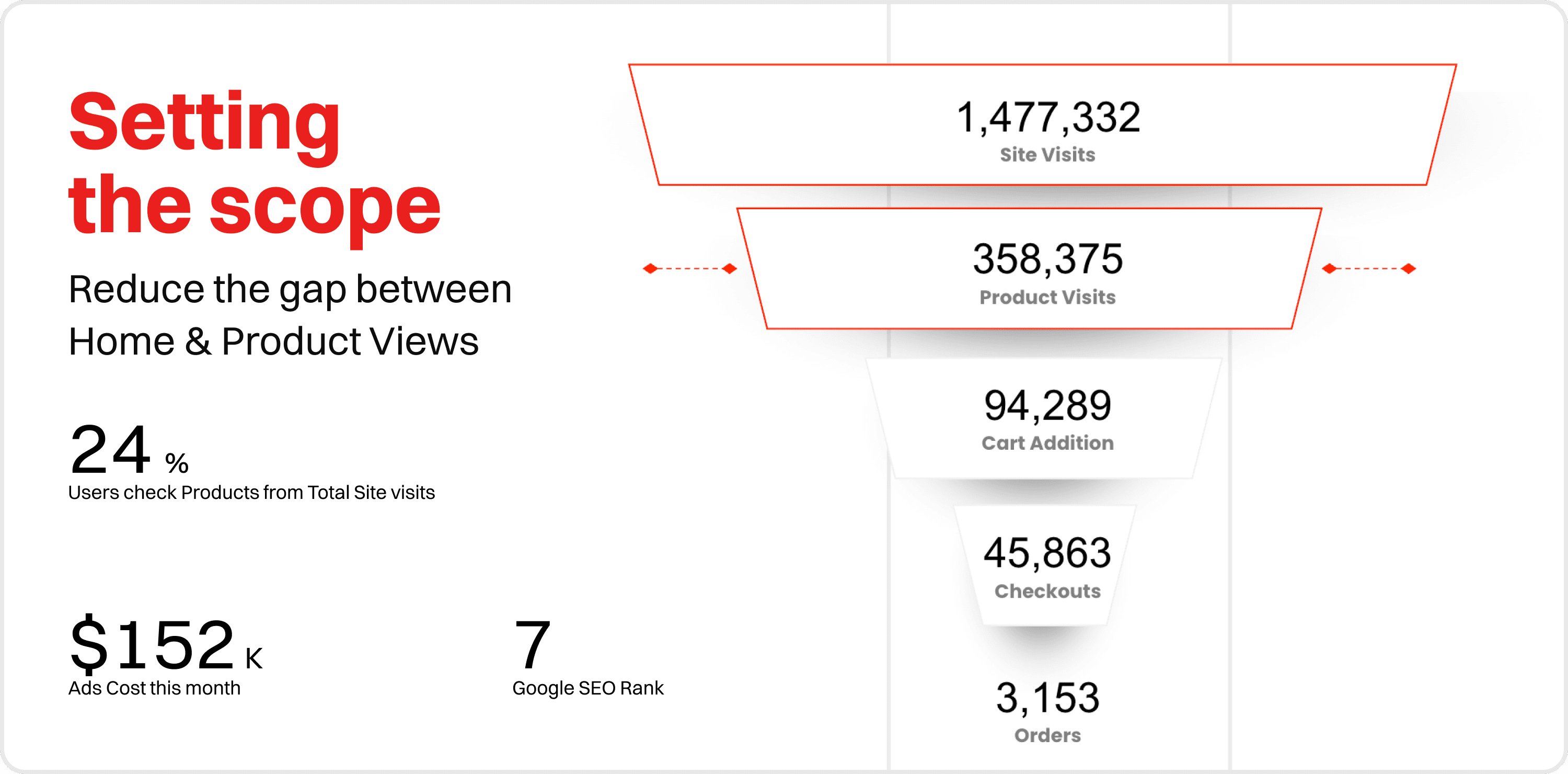
Vodafone's e-commerce platform had 1.4 million visitors and a 0.21% conversion rate.
The gap between 1.4 million site visits and 3,153 orders wasn't a navigation issue. It was money leaving the table at every single step of the funnel. 94K users added to cart. 45K reached checkout. 3,153 bought something.
Each drop-off had a design cause with a business cost attached to it.
Before touching a single screen, I reframed the entire engagement:
This isn't a UX refresh, it's a conversion problem with a design solution.
Reframe Vodafone's UX Impact as a Business Metric Problem
The funnel told the story nobody had framed yet.
In April 2019, Vodafone Egypt's platform pulled in 1.4 million site visits. Only 358K reached a product page. 94K added to cart. 45K reached checkout. 3,153 placed an order. A conversion rate of 0.21%.
Each drop-off had a design cause. Nobody had connected them yet.
I set the scope around one specific gap: the distance between site visits and product views. Shrink that gap and everything downstream improves. The brief stopped being about aesthetics and became about funnel physics.
Digging Into What Vodafone's Numbers Were Hiding
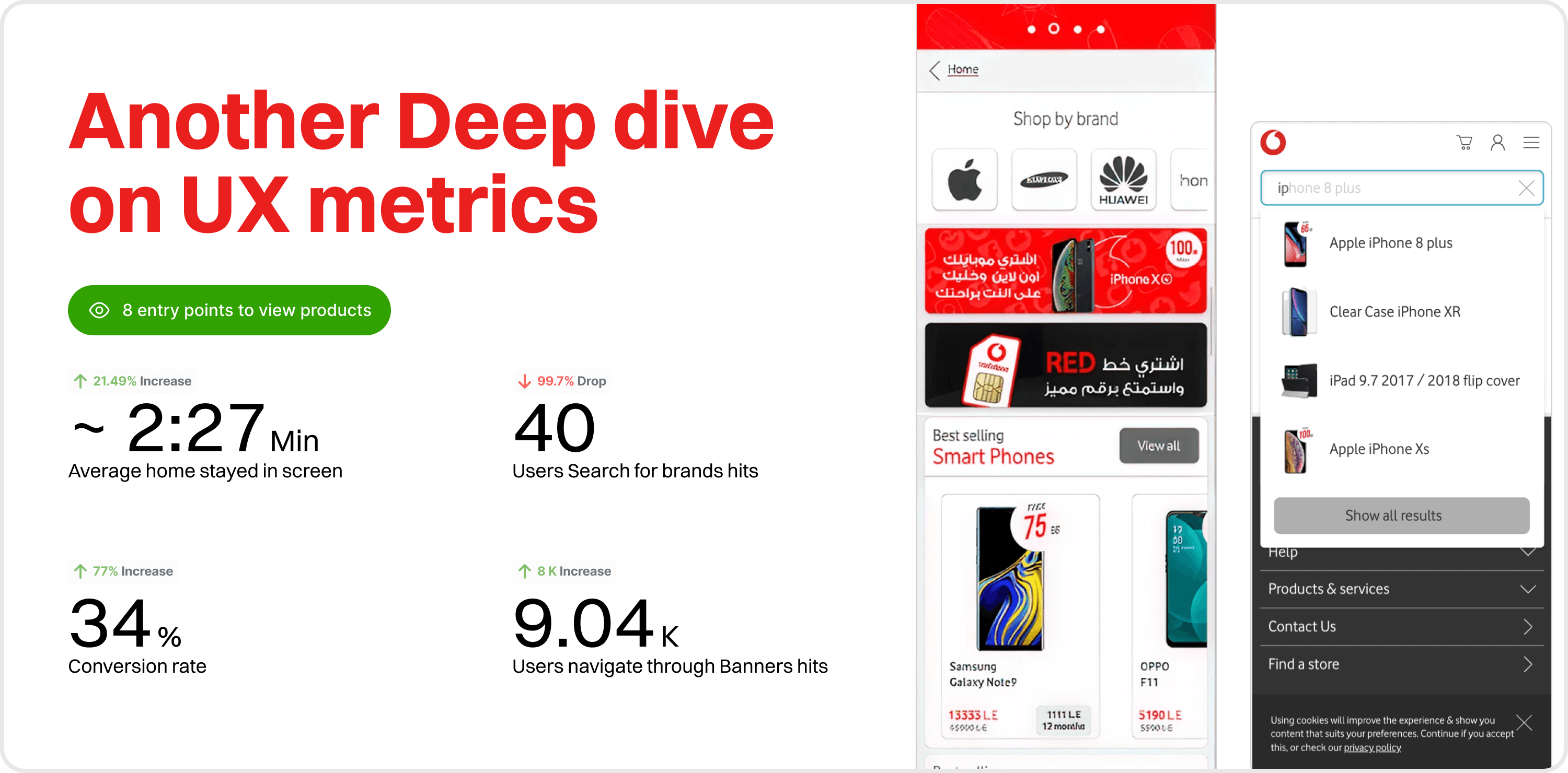
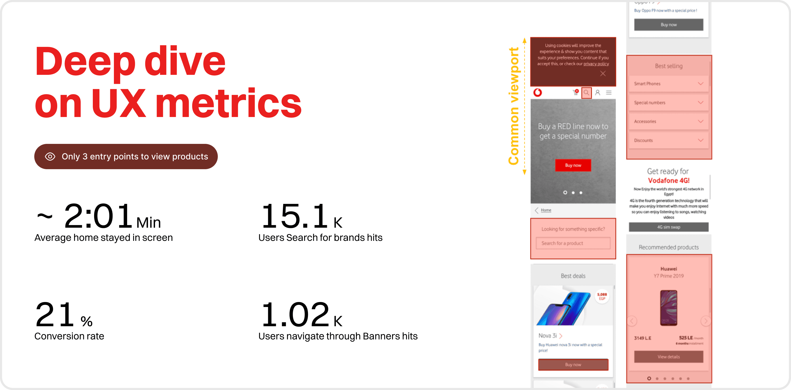
Before any solution, I ran a deep dive across six UX metrics: session time, search brand hits, mobile vs desktop split, entry points to product views, banner interaction rates, and conversion rate.
The findings were specific and damaging:
A cookie nudge was consuming 20% of the mobile viewport on entry
The search icon and search section were functionally invisible to users
The hero banner was killing 36% of first-impression attention without driving clicks
Vodafone's best-selling devices were buried below the fold
Recommended products showed a single item, creating a dead end
The most common viewport size was never accounted for in the layout
None of these were opinions. Every one had a number behind it.
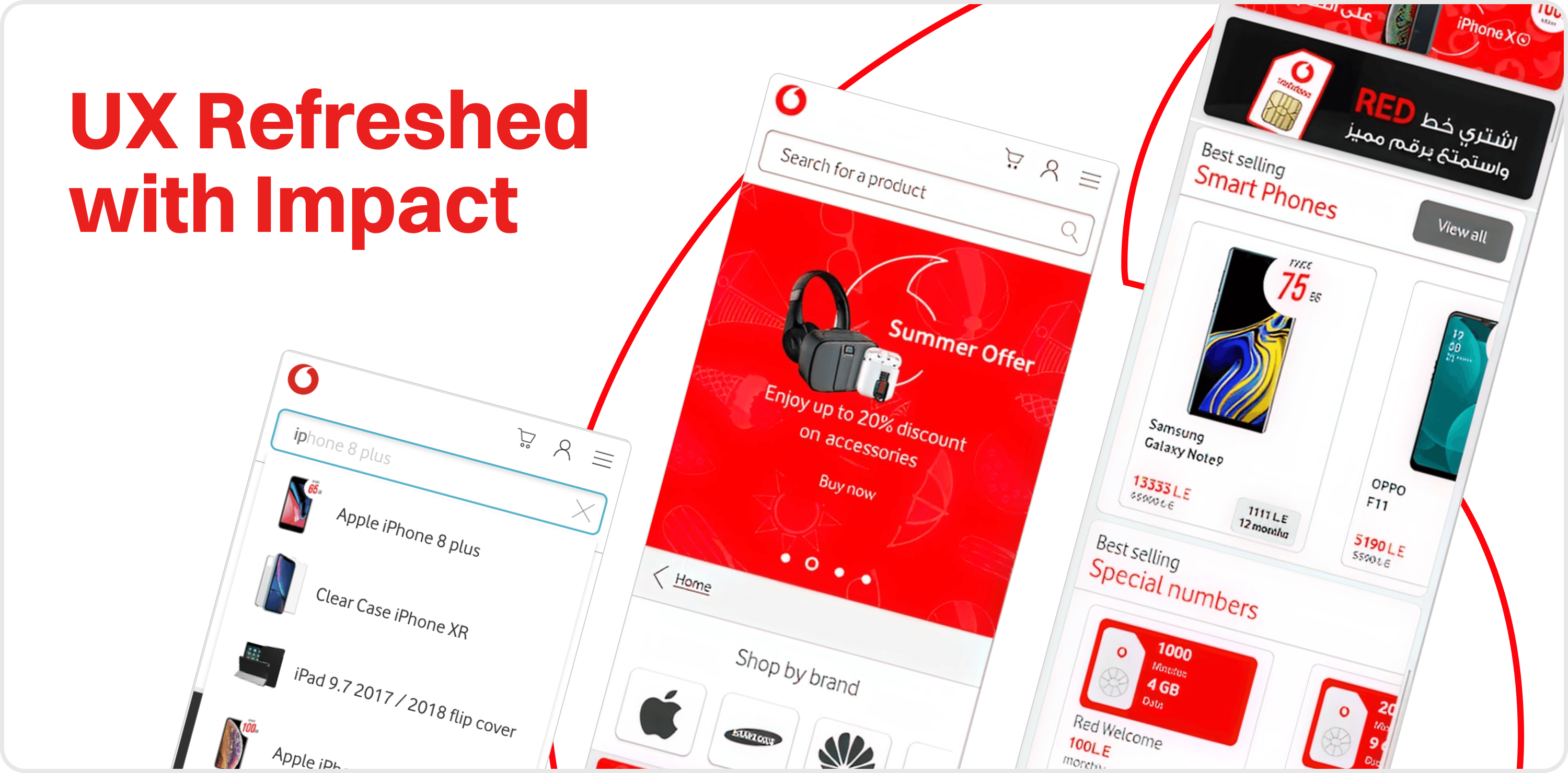
3 Design Priorities, Zero Vague Outcomes
The refresh organized around three measurable objectives:
Enhance Performance → remove the layout friction killing the path from landing to product page.
Give More Visibility → surface search, best sellers, and recommendations where users actually look.
Accessibility on the Go → fix the mobile experience that 71% of Vodafone's users were arriving through and leaving frustrated by.
Every design decision tied back to one of these three. If it didn't move a metric, it didn't ship.
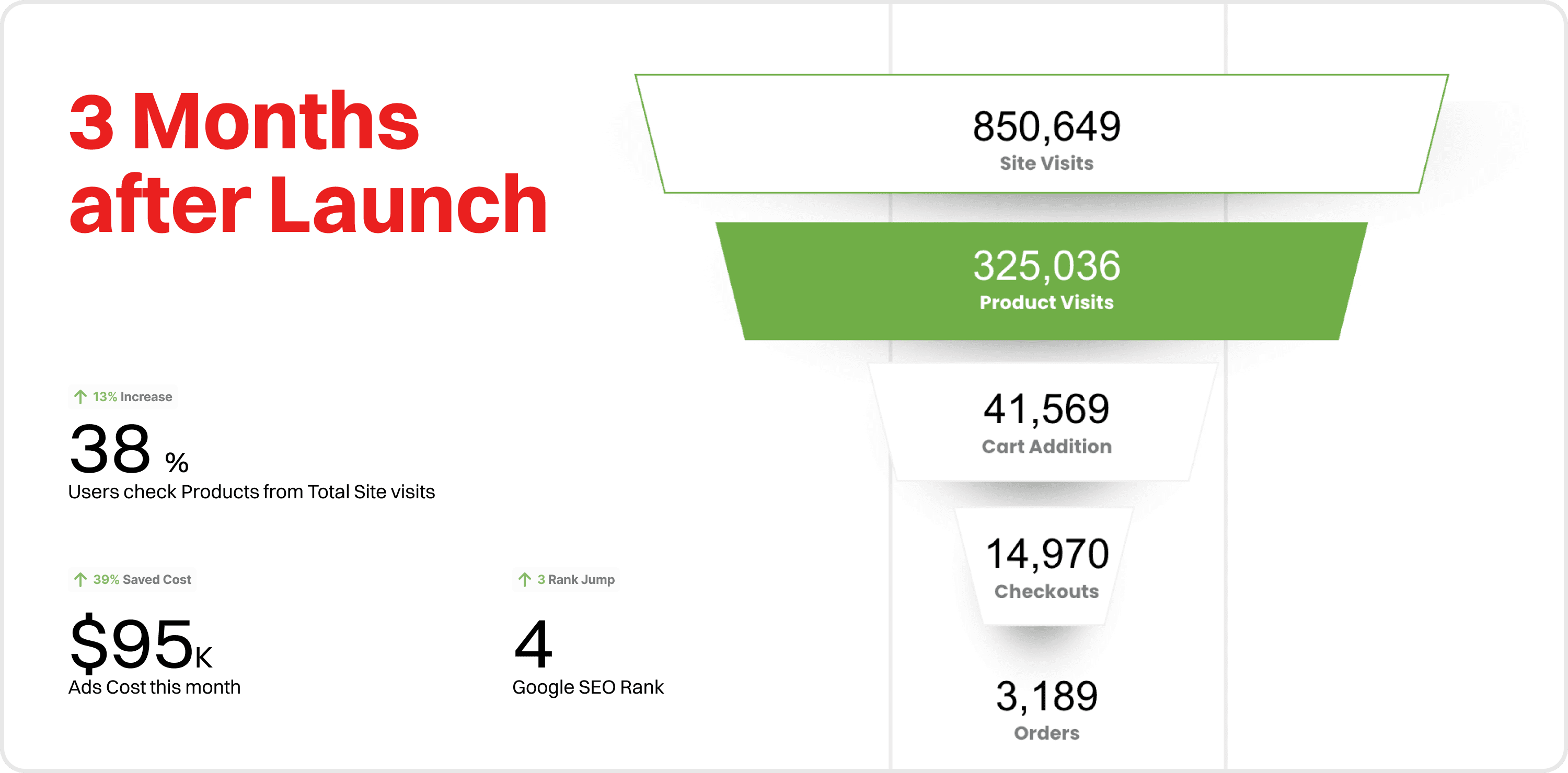
What Happened to Vodafone's Numbers
By July 2019, three months later:
Conversion rate climbed from 0.21% to 0.37%. Search brand hits jumped from 1,020 to 9,040. Session time grew from 2:01 to 2:27 minutes. Mobile share rose from 71.7% to 80.1%. Orders held at 3,189 despite site visits dropping from 1.4M to 850K, meaning Vodafone converted a smaller audience significantly better.
The number that stopped the room: ad spend dropped from $152K to $95K while orders increased. Search ranking climbed from position 7 to top 4.
More orders. Less spend. Better rank.